

































Last Updated on September 5, 2026 by Van Phillips
I’ve spent enough years reading price action to know a chart will tell you where money’s already flowing. What a chart won’t always tell you is why — and more importantly, whether that flow has structural legs under it or whether it’s just a crowd chasing a headline. This week I’m reallocating my Growth portfolio, which I do every quarter, I ran my whole thesis through something I don’t usually reach for: the BLS Employment Projections data I’ve been breaking down on this blog for the last two posts.
Turns out, it’s one of the sharpest tools I’ve found for separating real, structural growth from hype that’s about to run out of runway.
Stock prices react to earnings calls and headlines. Employment data reacts to something slower and more honest — what companies are actually staffing up to build, right now, for the next ten years. If an industry is hiring aggressively for a decade-long buildout, that’s not a trade. That’s a trend with a floor under it.
Let me walk you through how I’m using it, using my own portfolio and screener as the receipts.
Quick disclaimer before we go further: I’m not a licensed financial advisor, and nothing here is a recommendation to buy, sell, or hold anything. This is how I personally think about sector selection — do your own research and size your own risk.
The Framework: Let Labor Data Confirm the Thesis Before the Market Fully Prices It
Here’s the logic. When BLS projects an industry is going to add hundreds of thousands of jobs over a decade, that’s not a guess pulled from a press release — it’s built off of actual capital expenditure plans, output projections, and structural demand drivers already in motion. If a sector is hiring, it’s building. If it’s building, revenue is following. My job as a growth investor is to find the publicly traded companies sitting inside — or directly supplying — those hiring waves before the crowd fully catches on.
So I took the growth signals from the BLS 2025–35 projections and laid them next to my current portfolio and my growth screener. Here’s what lined up.
Signal #1: The AI Compute Buildout Is a Labor Story, Not Just a Chip Story
BLS flagged computing infrastructure, data processing, and web hosting as one of the fastest-growing detailed industries in the entire report — projected to grow 25.1% and add 120,400 jobs, driven directly by AI adoption. Professional, scientific, and technical services, the sector doing the R&D and engineering behind all of it, is projected to add 926,700 jobs, the second most of any major industry.
That’s not a chip story. That’s an entire industry staffing up to build, run, and maintain physical AI infrastructure for the next decade. And my screener is loaded with exactly the companies sitting inside that chain:
| Layer of the AI Buildout | Screener / Portfolio Names |
|---|---|
| Chips & fabrication | AMD, ASML, KLAC, LRCX, MRVL, MU, TER, TSM |
| Optical & photonic connectivity | POET (my portfolio), COHR, CIEN, LITE |
| Servers & hardware | SMCI (my portfolio), DELL, HPE, STX, WDC |
I hold POET Technologies and Super Micro Computer (SMCI) directly in this lane. POET makes photonic integrated circuits — the optical engines that move data between chips at the speeds AI clusters actually require — and SMCI builds the server racks that AI data centers are physically assembled from. Neither company shows up in a BLS table by name, obviously. But the underlying labor demand for the industry they sell into is spelled out in black and white: this isn’t a trade riding a headline, it’s a trade riding a hiring wave that’s projected to run for a decade.
Signal #2: Somebody Has to Physically Build the Power and the Buildings
This is the piece that took me longest to connect, and it might be the most underpriced idea in this whole report. AI doesn’t just need chips — it needs electricity and buildings, and BLS’s companion research on construction spells out exactly who benefits.
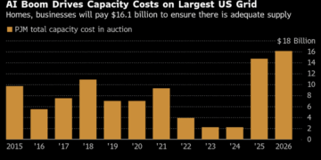
Utilities is the single fastest-growing major industry sector in the whole projection at +9.8%, driven almost entirely by electric power generation and transmission to meet AI power demand. And a separate BLS deep-dive on construction shows power and communication line construction and electrical contracting both growing at 6.6% — faster than any other construction subsector — specifically because of renewable capacity expansion, data center buildout, and EV infrastructure.
| BLS Growth Driver | Screener Names |
|---|---|
| Utilities / grid buildout, AI power demand | FLNC (my portfolio), BE, VRT |
| Construction & engineering for data centers, power infrastructure | FIX, PWR |
| Building materials for construction volume growth | UFPI (my portfolio) |
I hold Fluence Energy (FLNC), which builds grid-scale battery storage — exactly the kind of infrastructure utilities need as they lean harder into renewable capacity to feed AI power demand. And I hold UFP Industries (UFPI), a building products manufacturer that benefits any time construction volume rises, whether that’s data centers, grid infrastructure, or the broader 5.0% growth BLS projects for construction overall. My screener independently turned up Bloom Energy, Vertiv, Comfort Systems, and Quanta Services — all sitting in that same construction-and-power lane. That’s not a coincidence. That’s the labor data and the stock screener converging on the same story from two completely different directions.
Signal #3: The Sector With the Most New Jobs Isn’t in My Portfolio At All — And That’s Worth Sitting With
Here’s where I have to be honest with you and with myself. Private healthcare and social assistance is projected to add over 2.2 million jobs — more than any other sector, accounting for roughly 37% of all new jobs through 2035. It is, by a wide margin, the single biggest structural growth story in the entire BLS release.
And I have zero exposure to it in this portfolio.
A tech-heavy growth portfolio can feel complete while it’s actually just concentrated. The labor data doesn’t care what sector I’m comfortable in — it just tells me where the growth actually is.
That’s not a stock pick — I’m not naming names here, and this is exactly the kind of decision that deserves its own research pass, not a rushed addition because a blog post talked me into it. But it’s a gap the framework surfaced that a pure price screener never would have, because healthcare stocks haven’t necessarily been the loudest movers on a 12-month return basis. The labor data doesn’t grade on momentum. It grades on where the actual hiring is happening, and right now it’s screaming healthcare louder than it’s screaming anything else in tech.
Signal #4: Not Every Holding Needs a Perfect BLS Story — But Know Which Ones Don’t Have One
I also hold Cars.com (CARS), and I’ll be straight with you: it doesn’t map cleanly onto this framework. It’s a digital marketplace business, and BLS’s industry data doesn’t really carve out a clean “online auto classifieds” growth category the way it does for utilities or healthcare. That thesis rests on different legs entirely — platform economics, ad monetization, dealer subscription revenue — and I want to be clear-eyed that not every position in a portfolio needs to be justified by the same lens.
The value of this framework isn’t forcing every ticker into it. It’s knowing which of your holdings are riding a decade-long structural tailwind confirmed by real hiring data, and which ones are running on a completely different thesis that needs its own separate case made for it. Conflating the two is how people convince themselves a weak position is stronger than it is.
How This Shapes My Secured Puts, Too
I also trade cash-secured puts for income and as an entry strategy, and this framework changes how I pick underlyings for that too. Selling a put means you’re fine owning the stock if it gets assigned to you — so I’d much rather collect premium on names sitting inside a structurally growing lane (data center infrastructure, power buildout, healthcare) than on a name whose entire industry is facing the kind of headwinds BLS is flagging — retail trade at -0.2%, federal government at -3.4%, or any business model leaning hard on the office and administrative support roles projected to shed 752,100 jobs. If I get assigned, I want to be assigned into a decade-long tailwind, not a decade-long headwind.
The Bottom Line
Price charts tell you where money’s already moved. BLS employment data tells you where companies are actually staffing up to build the next ten years. Overlaying the two didn’t hand me new tickers out of thin air — my screener and my portfolio were already circling this exact cluster of AI infrastructure and power buildout names. What it did was confirm the why behind the trade, flag a real blind spot in healthcare, and sharpen how I’m thinking about which names deserve to survive this week’s reallocation and which ones are running on a thesis this framework simply doesn’t touch.
If you’re running your own growth screen, I’d encourage you to run it through the same lens before your next rebalance. Not as gospel — as one more filter, sitting next to your charts, not replacing them.
BLS industry and occupational data referenced here is available at BLS Employment Projections. This post reflects my own personal investing framework and is for informational purposes only — not financial advice.