
































Last Updated on July 22, 2026 by Van Phillips
I’ve been crunching numbers on this blog for a minute now — labor, FIRE, volatility, the whole ecosystem of how working people build something out of nothing. But there’s a number that sits underneath all of it, quiet but heavy, and that’s the cost of just existing somewhere. Rent. Groceries. The doctor. Getting your kid to school. Taxes taking their cut before you even see the check.
I sat with the 2026 numbers this week, and I want to walk you through what they’re really saying — not the headline inflation stat everybody quotes at the barbershop, but the county-by-county truth of where your dollar stretches and where it snaps.
“Cost of living isn’t a number. It’s a decision somebody made about your life before you ever walked in the door.”
That’s what I keep coming back to. Where you’re born, where you land, where you can afford to stay — that’s economics wearing a zip code.
Breaking Down What “Cost of Living” Actually Means
When people talk cost of living, they usually mean rent. That’s it. That’s the whole conversation most of the time. But rent is just one piece of a bigger puzzle. The real number — the one that determines whether you’re building or just surviving — is made up of seven pieces:
| Category | What It Covers | Why It Moves the Needle |
|---|---|---|
| Housing | Rent or mortgage, utilities | Usually the single biggest line item, often 20–30%+ of total cost |
| Food | Groceries, not takeout | Steadier than people think, but regional swings are real |
| Transportation | Car payment, gas, insurance, transit | Brutal in car-dependent counties, lighter where transit exists |
| Health Care | Premiums, out-of-pocket costs | Quietly one of the fastest-rising categories |
| Childcare | Daycare, after-school | Can rival rent in high-cost metros — this one breaks budgets |
| Taxes | State, local, property | The silent partner nobody budgets for correctly |
| Other Necessities | Everything else that keeps a household running | Small individually, adds up fast |
Here’s the thing — most cost-of-living conversations flatten all seven of those into one number and call it a day. That’s not enough information to make a real decision about your life. If you’re weighing a move, or just trying to understand why your paycheck feels thinner than it should, you need to see the categories separately.
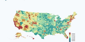
That’s exactly why I want to point you toward a tool I’ve been leaning on: the Interactive U.S. Cost of Living Map by County. It breaks down annual costs across more than 3,100 counties, and it lets you toggle household size and isolate individual categories — housing, food, transportation, health care, childcare, taxes, and other necessities — so you can see exactly where your money would actually go, not just a blended average that hides the real story.
If you’re doing FIRE math like I talk about on this blog, or you’re just trying to figure out if a move makes sense, that level of granularity matters. A county can look “affordable” on paper and still crush you in one specific category — childcare being the classic trap.
The State-Level Picture: Where the Floor and Ceiling Are
Before we zoom into counties, it’s worth seeing the wide view. On the expensive end, Hawaii sits at the top with median annual costs north of $72,000, driven by a housing burden that eats over a quarter of the budget. DC isn’t far behind, and that’s without even factoring in how much of DC’s cost structure is just proximity-to-power pricing. On the affordable end, states like Arkansas and Alabama are running median annual costs in the low $40,000s — nearly half of what Hawaii demands for the same basic life.
“The gap between the cheapest and most expensive state isn’t a lifestyle difference. It’s a different economy wearing the same flag.”
That spread is the whole reason remote work, relocation, and geographic arbitrage became such a big part of the FIRE conversation the last few years. Your income doesn’t have to change for your actual wealth-building capacity to double — sometimes all that has to change is your zip code.
The Top 10 Most Affordable Counties in America (2026)
Now let’s get specific. Based on the newest 2026 rankings — built off Census and BLS cost-of-living and housing-affordability data — here are the ten counties where your dollar goes furthest right now:
- Calhoun County, West Virginia
- Wyoming County, West Virginia
- Oglala Lakota County, South Dakota
- McDowell County, West Virginia
- Gilmer County, West Virginia
- Alfalfa County, Oklahoma
- Wilcox County, Georgia
- Smith County, Mississippi
- Lamar County, Alabama
- Webster County, West Virginia
A few things jump out immediately. West Virginia is holding down four of the top ten spots — no coincidence, given how consistently the state shows up near the bottom of the national cost index. And these aren’t population centers. Most of these counties sit in the five-to-twenty-thousand-resident range. That’s the trade-off that never makes the headline: the counties where costs are lowest are almost always the counties where job density, healthcare access, and amenities are thinnest too.
“Cheap and affordable aren’t always the same word. Cheap is the price tag. Affordable is whether the life on the other side of that price tag actually works for you.”
That’s not me talking these places down — several of them get real love from residents for community and quiet. It’s me saying: the number on the map is step one of the decision, not the whole decision.
The Top 10 Least Affordable Counties in America (2026)
Now flip the page. If the first list was about where your dollar stretches, this one’s about where your dollar gets swallowed whole before it even hits your bank account. Based on 2026 Census-derived cost data — median rent, income, and estimated salary needed to live — here are the ten counties where the price of admission is steepest:
- San Mateo County, California — median rent $2,749/mo, ~$109,940 estimated salary to live comfortably
- Santa Clara County, California — median rent $2,674/mo
- Marin County, California — median rent $2,455/mo
- San Francisco County, California — median rent $2,298/mo
- Orange County, California — median rent $2,235/mo
- Contra Costa County, California — median rent $2,206/mo
- Alameda County, California — median rent $2,202/mo
- Loudoun County, Virginia — median rent $2,201/mo, highest median income on the list at $178,707
- Arlington County, Virginia — median rent $2,162/mo
- Ventura County, California — median rent $2,136/mo
Look at that list close. Seven of the ten spots belong to California, and specifically to the Bay Area corridor — San Mateo, Santa Clara, Marin, San Francisco, Contra Costa, Alameda. That’s not random. That’s Silicon Valley money chasing a fixed amount of land, and everybody else’s rent absorbing the shock.
“High cost doesn’t always mean hardship. Sometimes it means the income caught up to the price tag. Sometimes it means the price tag ran off and left the income behind. You have to check both numbers before you know which story you’re in.”
That’s the real difference between this list and the affordable-counties list from earlier. Loudoun County posts a median household income near $179,000 — the highest on this whole ranking — which means a lot of folks there are genuinely keeping pace with the cost. Compare that to counties where rent is high but income hasn’t caught up, and you’re looking at a very different lived experience behind the same “expensive” label.
That’s exactly the kind of nuance the interactive cost of living map is built for — pull up any of these counties, break the cost down by housing, food, transportation, health care, childcare, taxes, and see for yourself whether the income side of the equation is actually holding up its end.
Reading Both Lists Together
Put the two rankings side by side and the real story of American affordability comes into focus:
| Most Affordable (Top 10) | Least Affordable (Top 10) | |
|---|---|---|
| Dominant region | Appalachia, rural South/Midwest | California Bay Area, DC suburbs |
| Typical population | Under 30,000 residents | Dense, high-income metro counties |
| What drives the number | Low housing demand, rural land | Tech wealth, land scarcity, federal-adjacent jobs |
| The trade-off | Lower cost, thinner job market | Higher cost, often higher income to match |
Neither end of this list is the “right” answer — it’s two different bets on what kind of life you’re building. What matters is that you make the bet with real numbers in front of you, category by category, instead of a vibe you picked up from a headline.
What This Means If You’re Actually Making a Move
If you’re running the FIRE math, or just trying to stretch a paycheck further, here’s how I’d use this data:
- Don’t shop by state — shop by county. The variance inside a single state can be enormous. A “cheap” state can still have expensive counties hiding in it.
- Isolate the category that actually threatens your budget. If you’ve got kids, childcare costs matter more than the headline number. If you’re remote and car-free, transportation savings might be your biggest lever.
- Weigh income against cost, not cost alone. A county with a lower median income and a lower cost of living can still leave you with less breathing room than a higher-cost county with a proportionally bigger paycheck.
- Use the interactive tool before you commit to anything. Pull up the county map, drop in your actual household size, and look at the category breakdown for anywhere you’re seriously considering. The averages in this article are a starting point — your real number is specific to your life.
The number on your paycheck only tells half the story. The other half is what it costs to keep that paycheck working for you instead of just working for rent, gas, and groceries. That’s the math worth sitting with in 2026.
This breakdown is for informational purposes and reflects modeled cost estimates, not personalized financial advice. Always run your own numbers before making a move.